Friday, 21 February 2014

Footage


These are the clips from my first day of filming on my first location, after looking around for best places to free run Michael Taylor the person performing in my video led me to a park he knew that e thought would be a good location to start the video. He was right, I thought this was perfect for the shots I wanted to get on the day.


 As this was my first day filming I wanted to make sure I got perfect shots so I took a good few takes to get them right.

There were also clips were Michael made some mistakes or didn't lad flips flips properly.


But the man reason I decided to take the same shot over again because I was not happy with how I held the camera. Some of the shots where shaky and for a couple I wasn't able to keep up with Michael while he was running across the shot.


I like this shot, I thought that the video would look better if throughout it had all sorts of angles. I wanted some shots as he is running towards the camera. I didn't want this shot to be shaky so I placed the camera on one of the pillars on the bridge to be sure I wouldn't shake the camera. Unfortunately I didn't take into a count the movement of the bridge as Michael ran across it resulting in the camera shaking a little bit.


Storyline


I have stated that my video will be telling a story of someone searching for his girlfriend/ past girlfriend, I have made some changes to how I will be setting it out. It takes a while for the song to get started, I thought it would be a good idea to start the video with him getting ready. Maybe having footage of him looking in the mirror putting on gloves just getting ready to leave the house, I had an idea to arc the camera around him until the camera is facing him. I could then zoom into a shot of one of his eyes. Here i'd like to change the colour to a grey scale and zoom back out with him sitting opposite his girlfriend, the grey of the scene representing that it is a scene from his past. I had another idea for him to  pass her something like a scarf, at the end of this scene I plan on again zooming back into his eye going back into the normal colour. As it zooms back out he is in a different location, this will be where the lyrics start and he will mime the words while the camera is still zoomed into his face. This shot will fade out and show him walking by, then he'll see her then see her leave. This is where the beat will pick up and there will be shots of the character free running, I plan on including many jump shots in the video to fit the pattern of the beat in the song. Near the end of the video when the song is dying down I will have him completely loose her, thats when he looks to the ground and sees the scarf abandoned. The camera will zoom out slowly and will eventually fade out.  

Wednesday, 29 January 2014

Posters

 All artists will have at some point a variety of posters promoting them, wether it'll be to promote a new album or a future tour or even a normal poster that you could find in any music shop. 

To be a successful poster it must contain content that clearly belongs in the genre being promoted. For example the colours used in the poster and how you use them are very important, as well as the colours used I must be sure to use fitting fonts and text styles making them stand out and clear to the audience.  

This is an example of a good simple music poster, there is not a lot happening in this example witch is exactly why I think it works. The black fading into the pale blue works great as a background against the pencil and ink drawing used as the man image. Using their house style text makes sure that this product will fit into the rest of their merchandise.


Another one of Nero's posters, this is a poster poster promoting a concert. The only thing that these two posters have in common is the Nero heading, they use the same font as they should throughout their work wether it be on albums or merchandise. Also the text seems to be in around the same area as the last one, this could be a house style choice to do this. I could see why, placing the main text on the lower third of the poster leaves plenty of space above for photographs, other text or graphical images.

The layout to this poster is very good, the clean clear text  easy to read on the dark background. They have also been sure to use a good font, something easy to read and stands out. As for the background, the really dark colours help the text really jump of the page. How the photograph has been placed on the page is good, using the text in the centre of the page.


Skrillex has a very recognisable logo and overall style for his posters and album covers, looking at the majority of his posters and covers it seems that he focuses on using graphics in the promotion of his albums/concerts. Looking at these posters its clear that the graphics are very important to his style, I don't think that this particular style will be best for my video.


This is a Deadmau5 poster, as you can see it has a strong difference compared to the Skrillex and Nero posters. It has a lot more comic based graphics and the colours used help make the poster fit right into the house style. I do like this style and I think that I could be very good at creating something like this. This will most probably be the sort of poster I will be using to form my own.


Friday, 24 January 2014

The Effects Debate

The media effects debate is a long standing question over how influential the media is towards the people exposed to it. An easy example is the question – does watching violent movies make the viewers violent?

The majority of music videos today have some sort of content that a high percentage of viewers may find to be inappropriate or offensive, this is normally the elder generation. The majority of elder viewers of these videos feel that they can give off the wrong example to younger viewers and make them want to copy the actions of the artist/artists in the videos. This has always been the case, from going back to the 50's and the birth of Rock n Roll. 

But going back to the purpose of this post it isn't just the content of the song that seems to bother people now, it is also the content of the videos. 
Marilyn Manson is a big example for the effects debate, his videos are inappropriate and I can clearly see how some people would be outraged with their children being exposed to him. But all the aggression towards him and his music from viewers come from the fear of their children thinking they should act like this.    

Tuesday, 10 December 2013

Website Analysis


This is a screen shot of the main page from Nero's official website. This site was completely empty much like their Facebook page, there has been no activity for a good few months I have put this blog post off for a while hoping that there maybe some sort of update on the website as well as their Facebook page.

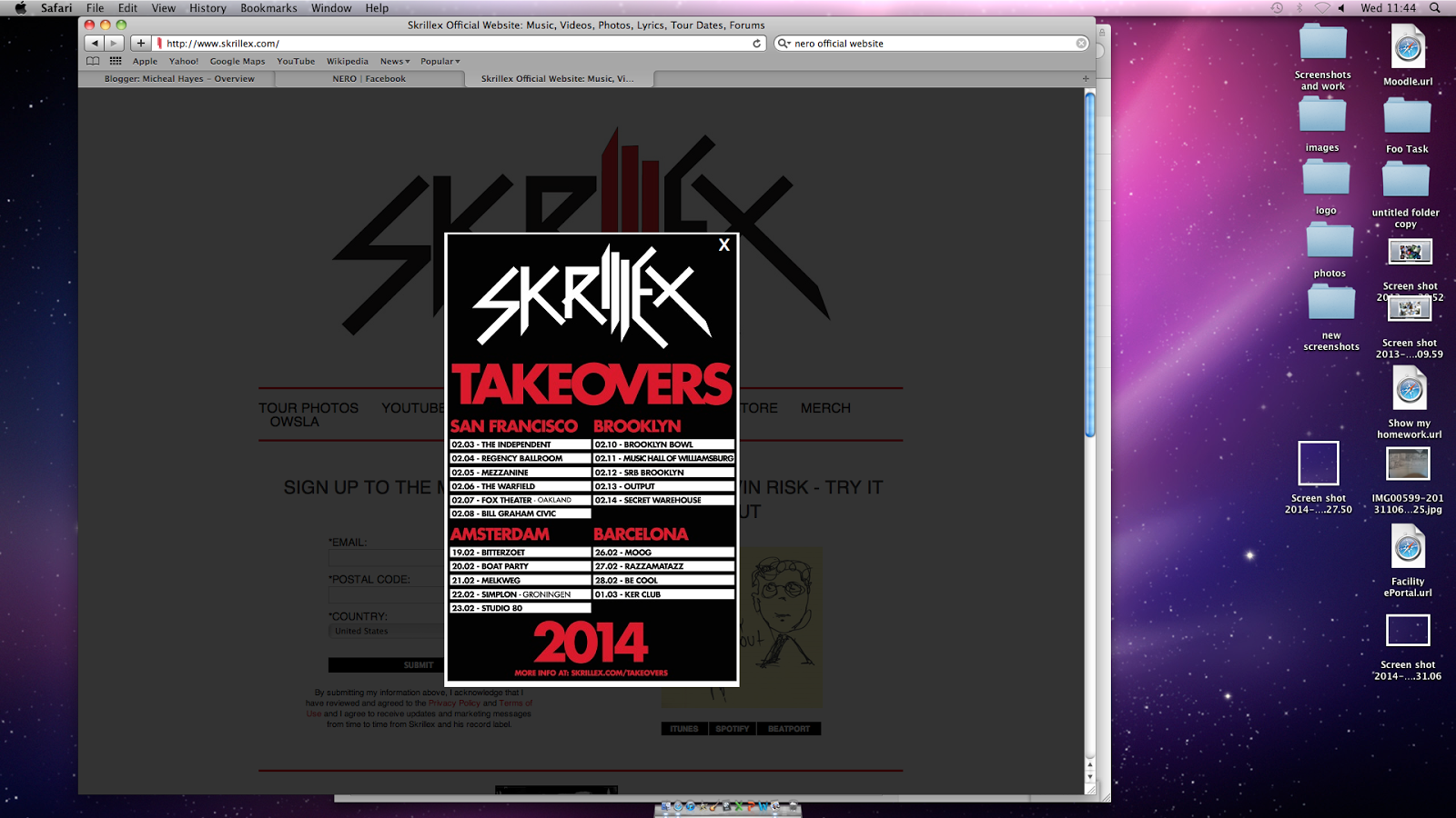
So instead of using Nero's site I have decided to use a different site from a different artist like Skrilllex. As soon as I visited this website I could see that there was quite a lot going on. One of my favourite things about this site is that when you open the site you get a quick look at the sites home page and then the artists tour dates and locations. This is something that I think I could gain marks from, so I am considering making one of these and placing it on my own site as a pop up.


After closing the tour poster I am presented with the home page of the website, as you can see this is a basic layout. The navigation bar is quite simple but does keep  with the house style of the site witch seems to be white backgrounds and thin red lines to create borders between sections.


Here is some screen shots from the Skrilllex site, these pages display the albums that Skrilllex have created. I to plan to have a section in my site with some past albums that my group have created. I don't think I will display my albums as simply as it is done on this site, I could use a slide show to display my album cover.


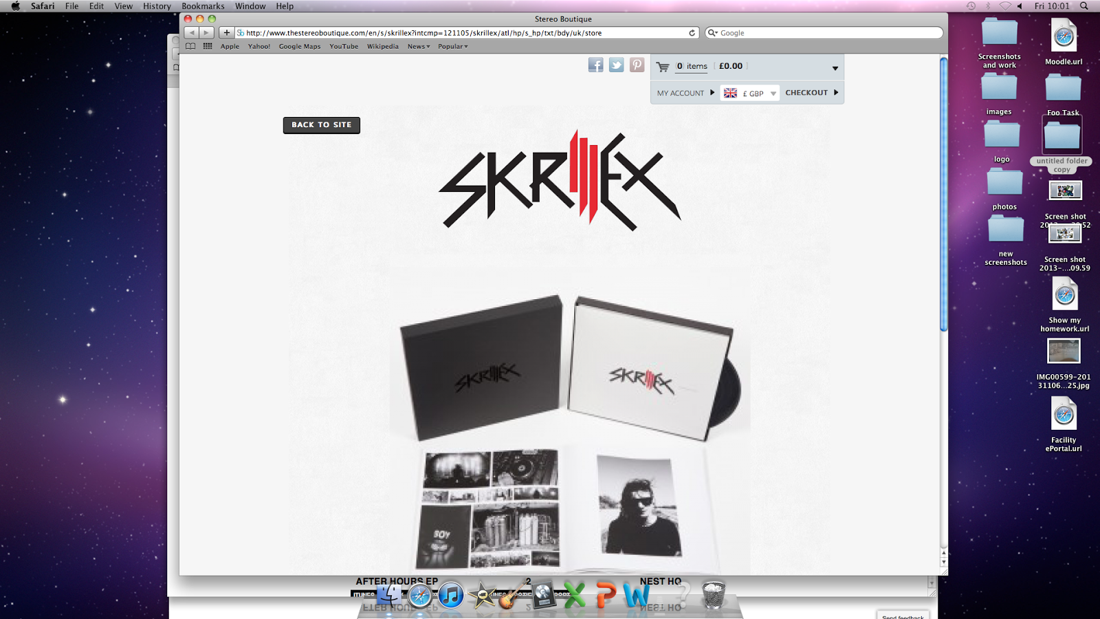
This is a screen shot of the online store for Skrilllex on their official site. It is always a great idea to have a store on your website, I think I could come up with some designs for products such as t-shirts, hats, jackets and shoes. There will also be the more predictable products such as copies of albums, posters and limited addition merchandise.


This is a shot from Skrilllex's Youtube channel, a link was provided in the navigation bar on the official site. There was also links to their Facebook, Twitter and Tumbler accounts.


Thursday, 5 December 2013

Twitter Analysis

Just like all artists Nero's Twitter page pretty much has the exact same posts as their Facebook page. " Sorry to have left you in the dark for so long. The 2nd album is coming 2014." This is the exact same post as displayed on their Facebook page, This isn't surprising as it is important that their fans all receive updates from them across all forms of social networking so that they feel reassured.

Monday, 2 December 2013

Facebook Page Analysis

This is a shot of the official Nero Facebook page, there doesn't seem to be a lot of content. The last post was in November of last year apologising for the lack of updates and state that the new album will be coming in 2014. I shouldn't be surprised as their website was the same, there wasn't any updates relating to their music except one telling us that the new album will be released in 2014.


As  I entered the photo albums for their Facebook page there was large portfolio of images ranging from old album art to photographs from their concerts. This is nothing surprising as all artists collect photographs from their shows as well as using past album covers in their portfolio.


I could stage some photographs for my own portfolio but I doubt I will be able to get the same quality images as seen in Nero's images. I will have to use a hall or some sort of stage and have people pose, I will end up running these images through photoshop to attempt to create the same sort of light and lazer effect like on these images to the left.


This is one of the final sections of their Facebook page, this is almost like a little forum for the fans. So they can ask questions on such things as tour dates and releases of new albums. Again I believe that this is something I could do for my page, it should make it more interesting than just a normal Facebook page.